Your ChartMogul dashboard is about to get a ton more useful… and a lot more fun! Starting today, you can add saved charts to your dashboard.
A more useful dashboard
What gets measured gets improved.
Somebody smart
While there are a few variants of this quote, they get at the same point — when you measure and track a specific metric, improving not only becomes possible, it becomes a priority. But it takes more than just measurement. Your team has to review the metric on a regular basis. Only then can they start to improve it.
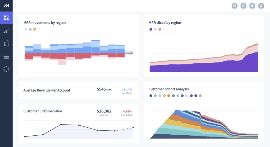
And this is why allowing you to add saved charts to your dashboard makes both saved charts and the dashboard more useful and relevant. Now your whole company can see your most important, customized subscription metrics — front and center — on a daily basis.
Practicing what we preach
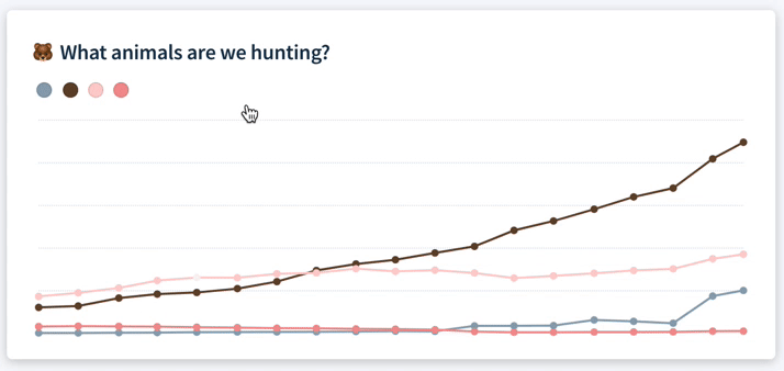
Here at ChartMogul, we’ve built a number of customized charts that our team relies on to help make good decisions:
- 🌆 MRR sliced by industry
- 🏝️ Launch plan signups
- 🔌 Customers sliced by billing system used
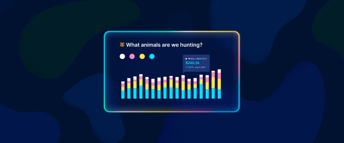
- 🐻 What animals are we hunting?
- 🌎 MRR sliced by region
Saved charts like these have helped us better understand our own business, for example, to see which of our integrations are the most popular, how many trials choose our free Launch plan, or which new industry segments show the most promise.
A brighter, more relevant dashboard 🌈🦄
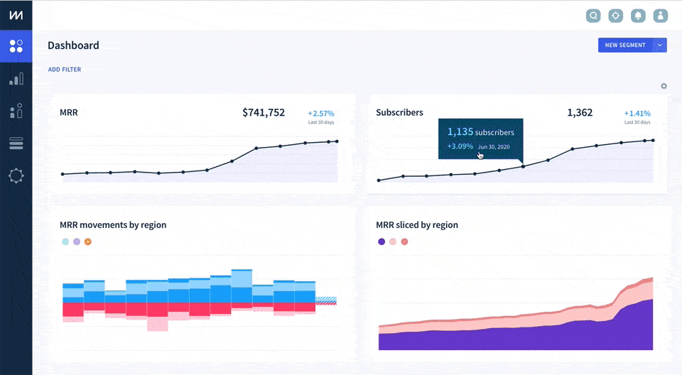
Custom charts are a lot more visually exciting than the default metrics. This means your dashboard can become more engaging and visually appealing than it was before, at the same time as becoming more relevant to your team!
Getting started
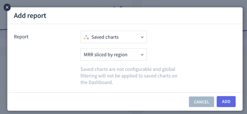
If you’re an Admin user in ChartMogul you click ⚙️ (in the top right corner of your dashboard) > Add report > Saved charts. You’ll then see a list of the charts you previously customized and saved. Select one and add it to your dashboard — it’s that easy. (Just be sure you’ve already shared the chart with your whole team.)
By the way — next time you save a new custom chart, you’ll be able to add it to the dashboard at the same time.
One more thing! 🥚🐇
We’ve included a tiny easter-egg-like piece of functionality in this release.
The colored circles on the saved charts act as both a chart key and a set of buttons. Click on the circles to switch in and out of Compare segments mode and also change which segment is currently visible on the dashboard.