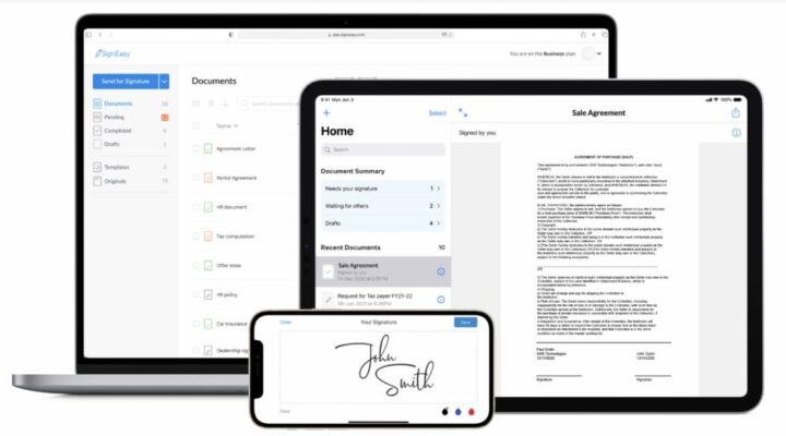
The SignEasy team is using ChartMogul to better understand their target segments and support the growth of the small to medium enterprise (SME) cohort.
What is SignEasy?
SignEasy helps businesses in over 150 countries eliminate paperwork by facilitating simple, secure, and legal e-signatures. The company is bootstrapped, profitable, and 80 people strong.

We’ve been witnessing a shift towards digitization for several years now but the acceleration increased dramatically in 2020. There’s a greater need now than ever before for adopting essential eSignature solutions. – Sudeep Shukla, Chief of Staff, SignEasy
It’s no surprise that the eSignature industry has been growing rapidly in the last few years. To learn about SignEasy’s growth, we spoke to Sudeep, SignEasy’s former data analyst and product manager, who recently stepped into the role of Chief of Staff to the CEO.
The Challenge: moving upmarket
Initially, SignEasy’s customers were people on the go. It was a mobile-first solution where a one-time payment of $5 would get users credits for signatures. As a result, the solution was adopted by a community of solopreneurs and freelancers.
The SignEasy team has changed gears since then and has been building powerful web-based features for small and medium-sized enterprises. With 150,000 subscribers, SignEasy is now focused on growing the SME segment.
Surprisingly, many industries haven’t adopted eSignatures just yet. The low market penetration for SMEs is where the opportunity for SignEasy lies.
To increase revenue we really need to understand what is working well for us. For example: How are sales going this month? What kind of accounts are we closing? If we’re falling short on our revenue targets, why? If you have visibility into your subscription data, you can take action.
When Sudeep joined the company, there was no visibility into their revenue because the data was sitting in three different systems. Every month Sudeep would manually pull reports from Google Play, the App Store, and Stripe, and put it all together in Excel sheets.
The executive team couldn’t wait until the end of the month to see what happened. This time-consuming, inefficient process had to be replaced. They needed a solution that would give the team a holistic picture of revenue, at any point in time.
Sudeep was already using ChartMogul’s knowledge base for his calculations so recommending ChartMogul to the executive team was obvious, and the implementation painless.
I remember that implementing ChartMogul was a breeze. Setting things up was just plug and play. And the new turn-key Google Play integration made me even happier.
SignEasy made ChartMogul their source of truth for all subscription metrics.
The Solution: complete visibility into customer segments
ChartMogul allowed SignEasy’s executive team to get a comprehensive picture of their revenue. While the CEO looks at the dashboard for a snapshot of the trends, the finance team checks cash flow reports to inform revenue reports.
The business segment in focus
It’s the MRR movements report that is key to Sudeep’s day-to-day.
I go straight to reports. I’m always looking at MRR movements to see how many new customers we’re acquiring. And I filter by ‘data source’ to look into the business cohort.
Sudeep looks into new and expansion business, churn and contraction in the last month, making sure that they are on the right trajectory. Where each data source represents a different business segment, filtering accordingly allows him to focus on the right data without any noise from other segments.
Being able to see what’s happening at any point gives you a lot of agility and lets you make decisions fast. That’s been one of the biggest advantages of using ChartMogul.
Pricing experiments informed by ARPA
SignEasy has experimented with different pricing strategies and price points for the new business plan. Initially, they were hesitant to increase prices. They didn’t want to lose key customers. However, looking into their subscription metrics has proven the positive impact of the price change. Higher retention of new customers greatly outweighed the lower number of price-sensitive users. Their Average Revenue Per Account (ARPA) is still going up.
When we bumped up prices, we grandfathered our customers on the lower prices. As we were getting more users, our ARPA is increasing. ARPA going up is an interesting trend to keep track of, because once it starts to plateau, that means there is one lever that we’re losing. ARPA is a very informative chart.
Churn on the individual vs business segment
Looking at churn data of all customers could be very misleading at SignEasy. Churn data from the mobile vs business segment tell completely different stories. For business customers churn is low. SMEs are not price-sensitive. However, in the cohort on mobile the churn is much higher. Users often buy and cancel within the first month.
Sudeep is looking at the cohort analysis for churn in the business segment separately to the individual segment. Segmenting churn reports by ‘data source’ is a must.
The Result: Transparent growth metrics for each segment
Business skyrocketed in mid-March 2020. The business cohort has doubled in revenue, while the individual cohort has grown by 20%. In the US, which is SignEasy’s top market, signups doubled. The Spanish market saw a 12x increase. On top of that, the number of weekly active users doubled during this period with the average number of documents signed per day tripled.
Revenue is the most important metric for any business. If you can slice and dice and see various dimensions of it then you can really figure out what is going on.
The company’s primary focus is now geared towards increasing the business segment. All the teams are aligned towards growing this cohort doubling down on sales and marketing efforts. At SignEasy, ChartMogul is key to move forward in their next stage of growth.
